Wednesday, February 26, 2014

BritaNews - Gorgeous Animated News/Magazine Theme (Blog / Magazine)


BritaNews is a news/magazine theme that using CSS3 in finest ways. Build your layout with Drag and Drop content Builder. BritaNews comes with built in unlimited rating criteria in metabox. A combination between modern design and exquisite code. See the demo to view the impressive animations and transitions on every detail. It’s responsive design ready to look great on any device.


\


All Features:

  1. White label

  2. Drag & drop page builder

  3. Retina ready

  4. 100% responsive (layout & video)

  5. Box & full width layout

  6. 10 colorschemes

  7. Translation ready

  8. Gorgeous CSS3 animation (Super smooth CSS3 animation effect)

  9. Smart Rating System (Animated Rating Bar)

  10. 600+ google fonts

  11. 3 in 1 content slider

  12. Theme options panel

  13. Embed ads into the post

  14. Smart code editor

  15. 12 columns grid system

  16. 8 different Homepages

  17. 4 different Blog loop layouts

    1. Masonry

    2. Grid

    3. Big Thumbnail

    4. Classic


  18. Sliding side menu in Mobile device

  19. Boxed and full width layout

  20. Included 18 seamless pattern background

  21. Font Awesome icon

  22. Newsticker

  23. Flickr Feeds

  24. Image Gallery with lightbox zoom effect

  25. Bonus: 23 HTML files


Credits:


Image Resource (theme preview)

  1. Unsplash.com

  2. The Lost Man Project

  3. Fotuwe

  4. deathtothestockphoto

  5. vonderauvisuals

  6. IdEA Meet up 2013 Photo Gallery


Javascript Libraries:

  1. jQuery 2.0.3

  2. jQuery Easing v1.3

  3. jQuery EasyTabs plugin 3.2.0

  4. jQuery FitVids 1.0

  5. jQuery Flickr Plugin

  6. jQuery FlexSlider

  7. jQuery Images Loaded

  8. jQuery wookmark plugin

  9. jQuery Sidr Menu

  10. jQuery superfish menu

  11. jQuery Prettyphoto

  12. jQuery Cookie


Framework Used:

  1. Aqua Page Builder by Syamil MJ

  2. Vafpress Framework by Vafpress


NOTE: All Images in Preview/Demo Site is for Demo Purpose Only, AND NOT included in the download file.

Changelog
CHANGELOG

==Version 1.4.0== December 19, 2013
Fixed: Glitch on all Design and layout elements on mobile devices.
Fixed: "Glass blog" appearance is now looks better if you put it in 1/2 column.
Fixed: Options for sticky menu (show or hide) is now works as well.
Added: Full layout width for category/archive, author post loop layout.
Added: Colorscheme on desktop will affect to adaptive layout too.
Changed: Code editor in admin panel is now have full width.
Changed: Newsticker animation is now using scroll effect.

==Version 1.3.0== December 17, 2013
Added: Unlimited Colorscheme
Added: Adaptive Layout. Added this feature for best performance and speed on mobile devices.
Added: Sticky Menu
Added: Option to Show or Hide Breadcrumbs
Added: Option to Show or Hide social share buttons (through theme options)
Added: Loop Layout Settings (through theme options panel). Configure the category/archive and author loop page.
Added: Now you can put page builder generated shortcode to category description (post » categories » the category). With this, you can customize each category with page builder content.
Updated: Page Builder Plugin. The content It’s now adaptive depends on which user agent.
Fixed: Remove Blank Featured Image if It’s not presented
Fixed: Menu color in dark layout was dark. It’s now light
Fixed: Several minor code bugs

==Version 1.2.0== December 12, 2013
Added: Options to Hide or Show News Ticker
Added: Dark Layout

==Version 1.1.0== December 9, 2013
Fixed: Bugs in Page title
Fixed: Bugs in search and 404 page
Fixed: Several minor bugs

==Version 1.0.0== December 6, 2013
First Release

Themer - Creative OnePage Responsive Folio Website (Creative)


Description


Themer is the ultimate and professional way for you to present your portfolio or the very best starting point for your own corporate website.

Themer is fully responsive – resize your browser window to see it in action. All the layouts are built with responsive design in mind. It works well on desktops, tablets, and mobile devices. The template is perfectly adapted to various screen sizes, and its attractive fresh design makes it look great.

Themer is a fully configurable and easy to use HTML website template with a lot of great features. It has been specifically designed to be easily customized and it’s created by using the latest HTML5 and CSS3 techniques. With a responsive design it is easily usable with any device!

If you are searching something different and out of the line please check out the Themer features:


    • Fully Responsive

    • One Page Website

    • Flat Design

    • Valid HTML5/CSS3

    • Advanced CSS3 Animations

    • Creative Homepage Layout

    • About Us Section

    • Skills Section

    • Portfolio Layout

    • Twitter Feed

    • Contact section

    • Well organized and commented code


Credits


All images and videos used in the demo are not distributed with the theme. They are all licensed under Creative Commons and credited to their respective creator/owner.

JavaScript


Mobile Premium Mobile Template (Curiosity)


Curiosity


Notice : (Close the top themeforest header if the demo wont show in the right size)

Curiosity is a great mobile template. Curiosity is a mobile optimized website with 14 different page.


Features :


  • 14 Different page

  • Image slider

  • Mobile gallery with fullscreen function

  • Countdown

  • Filterable portfolio with information

  • Working contact form

  • 2 Service page style

  • 2 Blog page style

  • Google fonts

  • Svg icons

  • Modern navigation

  • Documentation

Ciento Mobile Retina | HTML5 & CSS3 And iWebApp (Mobile)


General Features

  • Custom jQuery code.

  • Page preloader with fader!

  • Optimized for all types of mobile screens!

  • WebApp Ready!

  • AJAX/PHP Contact Form with validation!

  • Touch Swipe image slider!

  • Colorbox image gallery!

  • Photoswipe touch image gallery!

  • Full retina support for all graphic elements!

  • 800 icons availalble!

  • 40 icon lists availalble!

  • Google fonts integration!


Typograpghy features!

  • 1 text column!

  • 2 text columns!

  • 3 text columns!

  • 1 column with icon

  • 2 columns with icon

  • 3 columns with icon

  • 1 column with image

  • 2 columns with image

  • 3 columns with image!

  • Blockquote with icons!

  • Blockquote without icons!

  • CSS3 Highlighted text paragraphs

  • CSS3 Dropcaps text style!

  • CSS3 Table!

  • CSS3 Web 2.0 buttons

  • CSS3 Minimal buttons

  • List with icons!

  • Classic lists with numbers or bullet!

  • Thumbnail adaptive blog post!

  • Fullwidth blog post!

  • Ads widget in blog!

  • Recent widget in blog

  • Comments widget

  • Replies widget!


jQuery features!

  • jQuery Swipe Slider

  • jQuery Photoswipe thumbnail gallery!

  • jQuery Colorbox 1 column gallery!

  • jQuery Colorbox 2 column gallery!

  • jQuery Colorbox filtrable gallery!

  • jQuery Checkboxes ( retina ready )

  • jQuery Radioboxes ( retina ready )

  • jQuery On/Off Toggle! ( retina ready )

  • jQuery +/- Toggle ( retina ready )

  • jQuery Tabs

  • jQuery Classic Notifications ( retina ready )

  • jQuery Big Notifications! ( retina ready )

  • jQuery Header notifications!


Epsilon mobile framework! What is it


Epsilon is the most advanced and easiet to use mobile framework we’ve ever built! It’s made in such fashion that you’ll have all possible elements styled up for this specific template and all you’ll have to do is call them to your page!

Is Epsilon harder to use than coding old fashion way?


NO! It’s actually far far easier! All elements are dynamic, you can use as many as you want, they are just copy paste, replace with your information, done! That’s all!

How is Epsilon/Resepina is built?


Epsilon is the backbone of Resepina , it has 2 stylesheets and Resepina has the style.css and graphic elements!

  • style.css, has all the design elements of the template!

  • framework-style.css, includes all typography sizes and colors, element styles, and design features for the elements in Epsilon, styled for Resepina

  • framework.css, includes the sizes, alignment, spacing, visual hierachy of the elements! This is basically the engine of Epsilon!


Requires iOS 5.0 or higher, Android 4.0 or higher, Latest RIM, Windows Mobile 8!

WideBox - Responsive Multi-Purpose Theme (Corporate)


Clean, fresh, responsive and easy to customize, unique multipurpose Premium WordPress theme.
WideBox is a unique,fully responsive, fresh, html5, css3 WordPress theme with 10 different color variations and demo content with one click activation. Our shortcode system will make your life easier and demo data install is a breeze. With unlimited colour settings, custom backgrounds, amazing layered and revolution slider and much more this is truly fully customable wordpress theme. With great support we are sure this template will be a joy for you and your clients. It can be used for business and corporate sites, your portfolio site or customize it to suit your wishes. And please, if you like it do rate


WideBox features


  • Retina ready

  • Mega menu

  • Sticky menu

  • 4 heading views

  • Image shortcode for megamenu

  • Unique modern clean design

  • Built with bootstrap

  • Fully Responsive, easily enable or disable

  • Easy one click demo content import

  • Translation support (.po and mo files)

  • Advanced theme option panel

  • Well documented

  • 10 premade color options

  • 5 home views

  • unlimited color option with backend color picker

  • SEO optimized

  • Built with HTML5 and CSS3

  • Great shortcode system with lot’s of shortcodes

  • Contact form

  • Easy google analytics insert

  • lot’s of widgets

  • Cross browser support

  • Great support

  • Post sharing box with social icons

  • Amazing layer and revolution slider (30$ value)

  • Boxed and wide layout

  • 3 level menu

  • Portfolio filter

  • Custom backgrounds

  • 500+ fonts, powered by Google fonts

  • WordPress gallery

  • RTL (right to left) support

  • And much more…


Changelog:


Update: 08.01.2014 – v1.0.3
- added: RTL support
- fixed: missing calendar icon
- fixed: Portfolio loading issue
- fixed: Tabs responsive issue

Update: 05.12.2013 – v1.0.2
- fixed: Portfolio filter issues

Update: 14.11.2013 – v1.0.1
- fixed: Safari layout issues 
- updated: animations

Sources and Credits Fonts:


Arial – (standard system font on PC)
Open sans

Pictures that aren’t included

all images bought on depositphotos.com and photodune.net

Nayma - Responsive Multi-Purpose WordPress Theme (Corporate)


Hi everybody! Version 1.0.2 is out and ready to update!


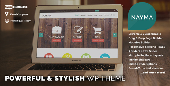
NAYMA is a stylish, multi-purpose and responsive WordPress theme suited for many, many different types of websites. Project showcasing, Shopping sites, Business websites, you name it. It was developed along WordPress best practices, with great attention to details to make your work easier than ever! With lots of options, an extremely flexible framework and still highly intuitive. Scroll down to see what’s inside.

Nayma - Responsive Multi-Purpose WordPress Theme

Nayma - Responsive Multi-Purpose WordPress Theme

Some words from our users


Your customer support here is superb!! I wouldn’t hesitate whatsoever in purchasing another one of your themes!
Thank You! Kerrie Oreilly

Can’t say how much I’m loving the theme – every time I wan’t to do something, it’s like it’s been thought of already! leethompson

AwesomeAwesomeAwesome! Bought several themes on here but never have the same level of support like QuadroIdeas!
Keep up the Superb support guys!! Secax

I’m a professional wordpress site designer, and I’ve used scores of themes over the last two years. This one is good! Creative design, certainly. But the administrative back end is very thorough and easy to use. There are a LOT of options for the user to customize without needing to get into the css files. Great job! Consafo

I love this theme and your support ROCKS! You guys have gone above and beyond in your help and support. I thank you! robyn_m

And now, for the readers, the full list of features


  • Responsive & Retina ready

  • Multilingual & Translation ready – Compatible with WPML

  • WooCommerce Integration – Fully implemented into the theme

  • 12 custom Builder Modules – NAYMA is loaded with 12 special modules. Create with them endless layout combinations Modules available are:

    • Free Premium Support!

    • One Page Site creation

    • 3 Custom Crafted Sliders

    • Slider Revolution

    • Empty Canvas (free text, HTML & Visual Composer)

    • Carousel (showcase any type of post!)

    • Recent Posts

    • Blog (masonry, classic or teasers styles)

    • Portfolio (with tons of available layout options)

    • Slogan + Call to Action

    • Team

    • Testimonials

    • Featured Post (a great way to feature a post)

    • Clients Carousel


  • Slider Revolution included! (Save yourself $16!)

  • Visual Composer included! (Save yourself $25!)

  • 600+ Google Fonts implemented

  • Custom Font upload

  • 360+ icons from the great FontAwesome!

  • 70+ Background Patterns for you to choose in every section!

  • 4 Styilish Header Types

  • Sticky header functionality

  • Top Dismissible Notice

  • Widgetized areas on Footer and Topper Header

  • Multiple Widget areas layout

  • 5 Custom QuadroIdeas Widgets (Twitter, Video, Image, Google Maps, Recent Posts)

  • Infinite sidebars available for every page

  • Contact Form 7 plugin integration. Already styled for NAYMA!

  • Export/Import Options Functionality

  • Options BackUp integrated

  • Demo Content + 1 click install!

  • Boxed & Stretched layouts

  • Social Icons with customizable styles

  • WordPress Post Formats support

  • Extremely flexible & useful Portfolio, with multiple layouts combinations, 4 single post layouts and Custom Fields creator

  • Easy and intuitive Options Panel

  • Ajax “Load More” functionality on Blogs & Portfolios

  • Layout, Design & Typography options

  • Page headers special styles

  • Parallax Background in Modules

  • Custom Backgrounds for every page


Credits & Warm Thanks


Changelog


---- V 1.0.2 ---- 9/1/2014 ----
- Fixed wp_kses issue on Theme Options
*inc/options-helper.php
- Minor tweaks
*style.css

---- V 1.0.1 ---- 7/1/2014 ----
- Fixed Slider Revolution Navigation for W3 Cache
- Minor tweaks
*style.css
*inc/back-styles.css
*js/admin-scripts.js
*inc/vcomposer-styles.css
- Fixed Page header backgrounds
*inc/extras.php
- Fixed links sanitization in footer
*inc/options-helper.php
- Improved Modules UI
*functions.php
*inc/custom-fields-functions.php
*inc/custom-post-types.php
- Fixed retina logo issue
*header.php

Liquid Premium HTML Template (Creative)


Liquid HTML is a modern blogging template, optimized for touch screen and small screen. You can create any CMS tempate with Liquid HTMl template

Scan by your smartphone/tablet:

Liquid HTML QR code

Theme Features


  • Modern style

  • Optimized for Mobile and Tablet

  • Styling for all WordPress widgets

  • Ready for WordPress theme

  • Full responsive


Licenses


Photo:

(All images for only demo, Don’t included in download package)

 
Fonts:


Javascript:


  • jquery.fitvids

  • jquery.flexslider

  • jquery.imagesloaded

  • jquery.infinitescroll

  • jquery

  • jquery.masonry

  • jquery.mobilemenu

  • jquery.placeholder

  • superfish

  • magnific-popup


Copyright @ 2013 Premium Templates and Themes.

Designed by Templateify & Sponsored By Twigplay