Showing posts with label site-templates. Show all posts

Monday, July 21, 2014

Move - Responsive One Page Parallax Template (Creative)


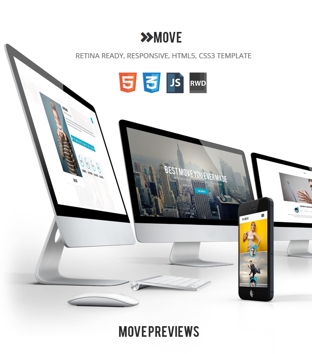
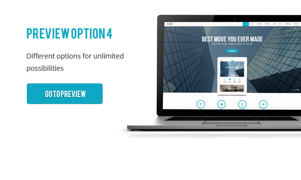
MOVE is clean, fresh and easy to customize, unique HTML Parallax 100% responsive template.
It can be used for business and corporate sites, your portfolio site or customize it to suit your wishes



8 predefined colour schemes
We added 8 predefined colour schemes to make your work easier, you will surely find a colour that fits your need .

Unlimited options
With advanced options, unlimited colour, parallax effects, layered slider included, video background option, you can truly create something unique to suite your need.

100% Responsive
Move is 100% responsive, from slider to the last element. It looks great on all devices.

Parallaxed
Move is using parallax scripts to enhances your style.

Custom backgrounds
With Move you can set backgrounds were ever you want, truly fully customisable.

Contact Form that works
Contact form is fully functional in all major browsers.

Font awesome and Bootstrap icons integrated
Overall you have amazing 560+ icons to really customise your template.

Browser compatible
Among all biggest browsers we also provided IE8 support.

Cool Code
The code is done cleanly without any fuss, so you can enjoy working on it.

Cool Code
The code is done cleanly without any fuss, so you can enjoy working on it.

Layered slider (10$ value)
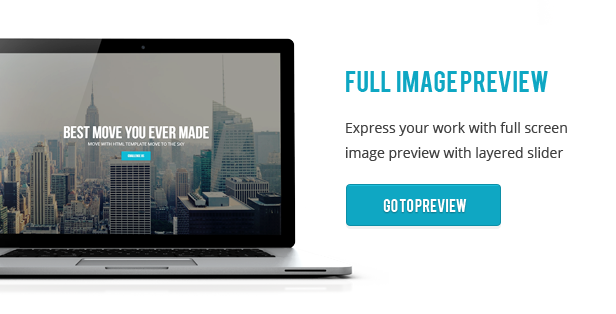
We have included layered slider with tons of options in it.

Extended documentation
We include the detailed documentation on how to use the theme and it’s features if that’s not enough you can always contact our fantastic support.

Awesome support
Just try us – support@anpsthemes.com

Credits:

Changelog:

Update: 08.01.2014 – v1.0.4
- fixed: mobile menu issue

Update: 11.12.2013 – v1.0.3
-fixed: Google Maps issue
-fixed: mobile menu issue(the menu no longer overlaps the slider on mobile)
-added: Blog pagination styling
-added: 8 predefined styles

Update: 06.12.2013 – v1.0.2
-fixed: sidebar font issue on rfc widget
-fixed: Google Maps issue
-fixed: single blog responsive sidebar issue

Update: 05.12.2013 – v1.0.1
-fixed: Ajax sidebar issue
-fixed: Isotope Ordering issues
-fixed: IE8 and IE9 menu issues
-fixed: IE8 issues(author image, colors, spacing, missing logo)
-fixed: mail PHP file
-changed: footer logo image
-changed: mobile menu
-added: favicon
-added: style for radio and check boxes
-added: better form validation
-added: documentation for elements

Thursday, July 17, 2014

Haven - Elegant One Page Responsive Template (Creative)


Haven Wordpress

Haven is an effortlessly stunning responsive template featuring subtle design elements and many flexible elements. Designed to give your brand or service an air of esteem and confidence, Haven is perfect for personal and business uses.

Features:

  • Fully responsive

  • AJAX masonry portfolio

  • Expanding projects area (via AJAX)

  • Working contact form

  • Retina ready icons

  • Support with a smile :)

Wednesday, July 16, 2014

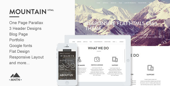
Mountain -One Page Parallax Html Template (Creative)


Mountain template (MNTN) is created in a flat style. It can be used from personal blog site or portfolio to creative company website, and everything in between. The parallax effect, smooth scrolling, flat design will allow your site to look stylish and modern.

  • HTML/CSS3 Template

  • Multiple header section layouts

    • Fullsreen Image

    • Fullscreen Slider

    • Video Background (YouTube)


  • Fully Responsive

  • Flat Design

  • Parallax Effect

  • Smooth scroll

  • FlexSlider

  • Google fonts

  • Ajax Contact Form

  • Well-documented

  • Clean commented code


Note: Demo images are not included


Any questions?


If you need help, we will be always glad to help you with any question you run into.Dashboard and mail are checked regularly during business hours (9:00h-18:00h UTC+02:00). We’ll get back to you as soon as possible, usually within 24-48 hours.


A special big THANK YOU for Hannah Lemholt that provide us with some of her amazing pieces to illustrate MNTN One-Page Html Template.
Hannah Lemholt

NOTE: Images used to illustrate the demo are copyrighted by its owners. The illustrators & designers mentioned above. In no way, any of these images are included on the final package you download from Themeforest. They are only used for demonstration proposals.

Monday, June 16, 2014

Sugar - Responsive Minimal Creative Template (Creative)


Sugar is an awesome and creative responsive HTML5 template created for corporate, portfolio and business websites. It is a very simple, clean and professionally for showcasing your work , really it is invention for your website.

It offers stunning design, really great compatibility and comes with super support.


Features


  • Responsive HTML5 and CSS3 design

  • Bootstrap 3

  • Cross Browser Compatibility

  • Search Engine Optimization

  • 500+ Google Fonts Usable

  • 24/7 Ask Questions via Forum

  • Documentation

  • Social Media icons

  • and much more


NOTE: The online samples images belong to their respective owners and are only used for demo purposes.

Video Presentation HD


Update


11 December 13 - responsive slider improved
7 December 13 - animation added
- documentation improved
6 December 13 - initial release

This is the HTML version of Sugar – Creative PSD

Other Resume Templates:


image

Sunday, June 15, 2014

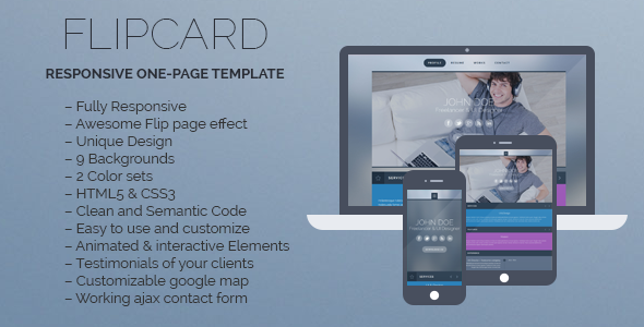
FlipCard - Responsive One-page Template (Personal)


FlipCard is a one page, fully responsive, HTML5 & CSS3 template with nice flip page effect. An excellent choice to make your own portfolio and introduce yourself.

Features


  • Fully Responsive

  • Awesome Flip page effect

  • Unique Design

  • 9 Backgrounds

  • 2 Color sets

  • HTML5 & CSS3

  • Clean and Semantic Code

  • Easy to use and customize

  • Animated & interactive Elements

  • Testimonials of your clients

  • Customizable google map

  • Working ajax contact form


Check it on your device.

QR Code generator

Credits


Photos & images

Fonts

CSS

Javascript

Changelog


Version 1.02 – 23/12/2013
Bug fixes in portfolio section on mobile devices.

Version 1.01 – 10/09/2013
Minor bug fixes
Added ability to add external links to the main menu

Version 1.00 – 08/08/2013
Initial Release

Monday, June 9, 2014

Saint | Responsive One Page HTML (Personal)


Saint is a Smart HTML Template for personal use like, photography, fashion, and portfolio. It is easily customizable and enhanch able. Saint is also responsive; it will easily fit with different device. So, take a look at the demo, you gonna love this.

Take Saint and Jump Start Now


Key Features


Version 1.0


 - Initial Release

Note: Images used in this preview are only for demo purpose and not included into Download Package.

Saturday, May 17, 2014

DesignBoost Onepage & Multipage Web Template (Creative)


Version 1.0.1 – Updated: 19.12.2013


Minor Update: - Now the Portfolio section on the Single Page template dynamically shows the selected portfolio item (it used to show the same one before).

DesignBoost is a modern responsive HTML template that can be used as a foundation for any purpose: blog, projects or photo portfolio, as well as a corporate website for your company or studio. It is based on Twitter Bootstrap 2.3, so if you are familiar with this framework, your possibilities for expanding and modifications of the template are practically unlimited.

Features


DesignBoost can boast a number of features, some of which include:

  • Fully responsive template, ready for all devices

  • 6 color schemes

  • 20 HTML pages

  • Based on the Twitter Bootstrap 2.3.2

  • Built with Sass and Compass (sources are provided in the sass folder)

  • Uses jQuery 1.10.2

  • Custom fonts via @font-face: Roboto and Roboto Slab

  • Two distinct, responsive and touch friendly sliders for the main page

  • Single page template

  • Custom design for all major Bootstrap components:

    • Buttons

    • Form fields

    • Dropdowns

    • Modal windows

    • Tabs

    • Accordeons

    • Alert boxes

    • Tooltips

    • etc.


  • Filterable portfolio

  • 3 options for portfolio listing page


    • 2 columns

    • 3 columns

    • 4 columns


  • 3 options for blog listing

    • 2 columns, sidebar on the left

    • 2 columns, sidebar on the right

    • 3 columns, sidebars on the left and right hand side


  • Pricing tables page

  • Custom 404 error page

  • Custom Contact Us page


Credits


This template uses jQuery and various plugins for it in order to create visual effects and provide better user experience. The following JS and jQuery libraries were used in this template:

The template also uses:

We hope you love our template and build the website that will be a joy to visit!

Thursday, May 15, 2014

Aufidius Mobile Retina | HTML5 & CSS3 And iWebApp (Mobile)


General Features

  • Custom jQuery code.

  • Page preloader with fader!

  • Optimized for all types of mobile screens!

  • WebApp Ready!

  • AJAX/PHP Contact Form with validation!

  • Touch Swipe image slider!

  • Colorbox image gallery!

  • Photoswipe touch image gallery!

  • Full retina support for all graphic elements!

  • 800 icons availalble!

  • 40 icon lists availalble!

  • Google fonts integration!


Typograpghy features!

  • 1 text column!

  • 2 text columns!

  • 3 text columns!

  • 1 column with icon

  • 2 columns with icon

  • 3 columns with icon

  • 1 column with image

  • 2 columns with image

  • 3 columns with image!

  • Blockquote with icons!

  • Blockquote without icons!

  • CSS3 Highlighted text paragraphs

  • CSS3 Dropcaps text style!

  • CSS3 Table!

  • CSS3 Web 2.0 buttons

  • CSS3 Minimal buttons

  • List with icons!

  • Classic lists with numbers or bullet!

  • Thumbnail adaptive blog post!

  • Fullwidth blog post!

  • Ads widget in blog!

  • Recent widget in blog

  • Comments widget

  • Replies widget!


jQuery features!

  • jQuery Swipe Slider

  • jQuery Photoswipe thumbnail gallery!

  • jQuery Colorbox 1 column gallery!

  • jQuery Colorbox 2 column gallery!

  • jQuery Colorbox filtrable gallery!

  • jQuery Checkboxes ( retina ready )

  • jQuery Radioboxes ( retina ready )

  • jQuery On/Off Toggle! ( retina ready )

  • jQuery +/- Toggle ( retina ready )

  • jQuery Tabs

  • jQuery Classic Notifications ( retina ready )

  • jQuery Big Notifications! ( retina ready )

  • jQuery Header notifications!


Epsilon mobile framework! What is it


Epsilon is the most advanced and easiet to use mobile framework we’ve ever built! It’s made in such fashion that you’ll have all possible elements styled up for this specific template and all you’ll have to do is call them to your page!

Is Epsilon harder to use than coding old fashion way?


NO! It’s actually far far easier! All elements are dynamic, you can use as many as you want, they are just copy paste, replace with your information, done! That’s all!

How is Epsilon/Resepina is built?


Epsilon is the backbone of Resepina , it has 2 stylesheets and Resepina has the style.css and graphic elements!

  • style.css, has all the design elements of the template!

  • framework-style.css, includes all typography sizes and colors, element styles, and design features for the elements in Epsilon, styled for Resepina

  • framework.css, includes the sizes, alignment, spacing, visual hierachy of the elements! This is basically the engine of Epsilon!


Thank you dkoated.com for the coach arrows!

Attention! Certain devices may not support body dragging, for example, the Nokia Lumia can freeze up! We’ve implemented functionality for both the button and the body to deploy the navigation! We’re not responsible if your device doesn’t support CSS3 transform transitions!


Requires iOS 5.0 or higher, Android 4.3 or higher, Latest RIM, Windows Mobile 8!

Office Art - One Page Parallax (Creative)


Magnificent one page parallax website.


Office Art is fully responsive and offers stunning design and great support.

Video Homepage


Full Screen Slider


Static Image


Office Art Features:

  • Fully Responsive

  • Created with the latest HTML5 and CSS3 coding standards

  • Smooth Scrolling

  • Full Screen Slider

  • Cool Animations

  • Parallax Effect

  • Extremely easy to customize

  • 7 preset color skins

  • Cool portfolio section


Preview Image Credits

Sunday, May 11, 2014

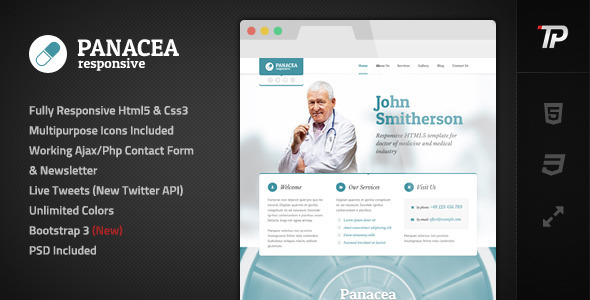
Panacea Responsive Parallax Site Template (Personal)


IMPORTANT: Support is offered exclusively on our Support Forum not here in the comments section. We do however answer pre sale questions in the comments so feel free to ask them.

FEATURES:


  • Fully responsive HTML5/CSS3 design

  • Set of multipurpose icons included

  • Working AJAX/PHP contact form & newsletter

  • Live Tweets – required PHP, uses new Twitter API

  • Unlimited, easy to set up colorsets

  • Built with Bootstrap 3 (new)

  • PSD included

  • Clean and multipurpose design

  • Parallax effect with mobile support

  • Embed parallax images easily – add any image and “checker” overaly will be added automatically


Changelog


changelog

Please note that demo images are not included.
Framework:


Scripts:

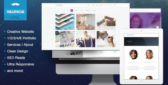
Valencia - Creative Flat iOS7 Inspired Template (Creative)


img

Description


Valencia is the HTML template developed especially for creative studios, freelance designers and modern companies that want to look clean, modern and cool at the same time.

It is compatible with all modern browsers and search engine friendly.

This is the HTML version of Valencia Modern PSD Template

Pages


  • Home

  • Team

  • Services

  • Pricing Table

  • Blog

  • Blog Single Post

  • Typography

  • Item Lists

  • Columns

  • Buttons

  • Portfolio

    • 1 Column

    • 2 Column

    • 3 Column

    • 4 Column

    • 6 Column


  • Single work page

  • Contact


Features


  • 20 HTML templates

  • Responsive Design

  • Blog Page / News

  • Cross Browser Compatibility

  • Search Engine Optimization

  • 500+ Google Fonts Usable

  • 24/7 Ask Questions via Forum

  • CSS3 Animations

  • Social Media icons

  • and much more


NOTE: The online samples images belong to their respective owners and are only used for demo purposes.

Video Presentation HD


Update


11 December 13 - initial release

Saturday, May 10, 2014

Mobilebar Mobile Retina | HTML5 & CSS3 And iWebApp (Mobile)


General Features

  • Custom jQuery code.

  • Page preloader with fader!

  • Optimized for all types of mobile screens!

  • WebApp Ready!

  • AJAX/PHP Contact Form with validation!

  • Touch Swipe image slider!

  • Colorbox image gallery!

  • Photoswipe touch image gallery!

  • Full retina support for all graphic elements!

  • 800 icons availalble!

  • 40 icon lists availalble!

  • Google fonts integration!


Typograpghy features!

  • 1 text column!

  • 2 text columns!

  • 3 text columns!

  • 1 column with icon

  • 2 columns with icon

  • 3 columns with icon

  • 1 column with image

  • 2 columns with image

  • 3 columns with image!

  • Blockquote with icons!

  • Blockquote without icons!

  • CSS3 Highlighted text paragraphs

  • CSS3 Dropcaps text style!

  • CSS3 Table!

  • CSS3 Web 2.0 buttons

  • CSS3 Minimal buttons

  • List with icons!

  • Classic lists with numbers or bullet!

  • Thumbnail adaptive blog post!

  • Fullwidth blog post!

  • Ads widget in blog!

  • Recent widget in blog

  • Comments widget

  • Replies widget!


jQuery features!

  • jQuery Swipe Slider

  • jQuery Photoswipe thumbnail gallery!

  • jQuery Colorbox 1 column gallery!

  • jQuery Colorbox 2 column gallery!

  • jQuery Colorbox filtrable gallery!

  • jQuery Checkboxes ( retina ready )

  • jQuery Radioboxes ( retina ready )

  • jQuery On/Off Toggle! ( retina ready )

  • jQuery +/- Toggle ( retina ready )

  • jQuery Tabs

  • jQuery Classic Notifications ( retina ready )

  • jQuery Big Notifications! ( retina ready )

  • jQuery Header notifications!


Epsilon mobile framework! What is it


Epsilon is the most advanced and easiet to use mobile framework we’ve ever built! It’s made in such fashion that you’ll have all possible elements styled up for this specific template and all you’ll have to do is call them to your page!

Is Epsilon harder to use than coding old fashion way?


NO! It’s actually far far easier! All elements are dynamic, you can use as many as you want, they are just copy paste, replace with your information, done! That’s all!

How is Epsilon/Resepina is built?


Epsilon is the backbone of Resepina , it has 2 stylesheets and Resepina has the style.css and graphic elements!

  • style.css, has all the design elements of the template!

  • framework-style.css, includes all typography sizes and colors, element styles, and design features for the elements in Epsilon, styled for Resepina

  • framework.css, includes the sizes, alignment, spacing, visual hierachy of the elements! This is basically the engine of Epsilon!


Thank you dkoated.com for the coach arrows!

Attention! Certain devices may not support body dragging, for example, the Nokia Lumia can freeze up! We’ve implemented functionality for both the button and the body to deploy the navigation! We’re not responsible if your device doesn’t support CSS3 transform transitions!


Requires iOS 5.0 or higher, Android 4.3 or higher, Latest RIM, Windows Mobile 8!

Tuesday, May 6, 2014

The Tree - Unique HTML/CSS One-Page Template (Personal)


“The Tree” is a stylish HTML/CSS site template suitable for your own portfolio. We worked really hard on creating this HTML5 & CSS3 portfolio website template.
Everyone of the words of the tree can be changed with new one!

“The Tree” is different, creative, innovative and user friendly template that you may enjoy having for your portfolio, personal site or something else. The unique and clean design allows you to use the template for every kind of your business.
“The Tree” Portfolio template give you the possibility to make a unique portfolio website that stands out of the crowd! This is a perfect way to display your creative work. You can easy change background color and the color of active buttons with other. “The Tree” is too easy to edit with your own content.

Find Us


facebook


twitter


envato

Theme features


    • Stylish and unique design.

    • Fancybox gallery – you can show uploaded images from the Projects.

    • A place where you can enter your skills.

    • A place where you can.


post opinions from your clients.

  • Jquery enhanced user interface – tabs, lightbox photo preview.

  • Social information – facebook, linkedin, twitter, etc.

  • Layered Psd File.

  • HELP files included.


Sections:


  1. About

    • Team

    • Skills


  2. Projects

    • Opinions (Comments) – Opinions of your clients


  3. Services

  4. Social information

  5. Contacts – contact form

  6. Find – this includes tree sections.

    • In the first one you can write your address.

    • In second one your location.

    • And in the last one you can post your phone and email.


  7. Footer


See also our other site template


Wednesday, April 30, 2014

Newstick Responsive News & Magazine Template (Creative)


Newstick is a responsive site template that has clean and elegant design for blog template. This site template completed with 6 colors variant(blue, green, lightblue, orange, purple, yellow) that you can choose your own.

Documentation

Features


  • Bulit with bootstrap

  • Responsive design

  • Use 1200 grid system

  • News & magazine template

  • 6 colors variant

  • HTML5 valid

  • JavaScript validation with JSHint

  • 5 PSDs include

  • 22 different HTML pages

  • Review & rating post

  • Image, permalink, facebook, twitter, video, audio, quote post type

  • Pretty photo

  • jQuery isotope for filtering portfolios

  • Clean template and code

  • FontAwesome icon packs

  • Twitter integration

  • Contact form element with AJAX (send direct to your email)

  • Mailchimp integration

  • Cross browser also in IE8

  • SEO friendly

  • Well documented

  • Easy to customizable


Notes:


  1. Images in the demo are not included in the download package.

  2. This is only site template (HTML/CSS template), not wordpress theme.


Keep In Touch


Facebook
Twitter
Themeforest
Official Site


Copyright @ 2013 Premium Templates and Themes.

Designed by Templateify & Sponsored By Twigplay